

See How I Have Redesigning My Substack Homepage (quick tutorial)
If you’ve ever looked at your Substack website and thought, “This doesn’t feel like me,” you’re in the right place.


“Your dreams are worth running after. Show up for your dreams and do the work.”
Those words have been sitting with me all month.
September became a month of double growth for me, both personal and creative.
At the start of the month, I felt a quiet discouragement creeping in, as if I had slipped back into another cycle of hustling. But instead of pushing harder, I did the opposite. I slowed down. I started writing again with one simple thought: there are still flowers that grow in September.
Growth, I realised, doesn’t depend on pace. It depends on presence.
As my newsletter began to grow, I noticed something that didn’t feel quite right. My Substack homepage, the first thing new readers see, no longer reflected the calm and encouragement I wanted people to feel when they arrived. It felt mismatched with the voice and rhythm of my writing.
When I first launched my Substack website, I built it quickly, just wanting to start. I didn’t think much about visuals or layout. I used AI-generated images because it was easy, but over time, they started to feel disconnected from my message.
That’s when I realised something deeper. This space isn’t just a creative outlet. It’s part of my calling. When something is your dream, you show up differently. You begin to care about the details, the look, the feel, the experience you are creating for others. My dream has always been to build a newsletter that inspires and encourages people, and I wanted my Substack homepage design to mirror that intention.
So, I did a full audit of my newsletter. I revisited every part of my Substack layout, from the banner and colours to the fonts and homepage sections. I redesigned it from the ground up, creating a space that finally felt like home. When I shared a picture of the update, so many of you resonated and asked for guidance.
That response inspired me to create a step-by-step guide and video tutorial on how to edit your Substack homepage. You’ll learn everything from changing your logo and colour palette to adding content blocks and subscribe messages.If you’ve been thinking about refreshing your Substack website or creating a more intentional space for your readers, this guide is for you.
💡 If you prefer to watch a step-by-step tutorial, scroll to the end of this newsletter to see the full video walkthrough on how to edit your Substack homepage.
How to Build Your Substack Home Page
🌱 Step 1: Build a Cohesive Brand on Your Substack Website

Now, let’s have a look at how you can start organising and building your homepage.
When you log into your Substack dashboard, click Settings, then select Website. On the right-hand side, you’ll see Website Settings. Once you click that, you’ll find a full section dedicated to your Substack homepage design — and it’s much simpler to use than most people realise.
This is the space where you can edit, rearrange, and personalise almost every part of your publication. It’s where your Substack website truly comes to life.
Branding Section
On the left-hand side, you’ll find the Branding settings. This section allows you to customise your logos, colours, and typography — all of which help shape your publication’s visual identity and create a sense of consistency for your readers.
Logos

This is the first step in setting up your brand presence.
You have two options in the left-hand Branding panel:
Publication Logo:
Click Add logo to upload your existing logo. If you don’t have one yet, try using Substack’s built-in AI image generator, or create a simple logo in Canva. Even a minimal icon can help your Substack homepage look polished and trustworthy.
Publication Watermark:
This replaces your text title in the navigation bar, giving your Substack website a clean, professional look. It’s a small detail, but it makes your publication instantly more cohesive.
Colours
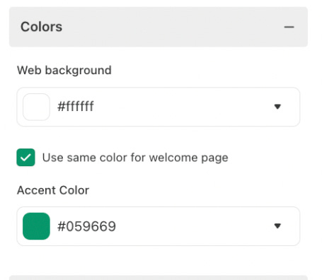
Next, it’s time to choose your colour palette. Colours are one of the most powerful parts of your brand identity. They set the emotional tone for your readers and play a big role in how people feel when they land on your Substack homepage.
Web Background:
This controls the main background colour of your publication. Pick something that aligns with your brand — calm neutrals, soft tones, or vibrant shades that represent your message. To match your brand colours precisely, copy the HEX code from your Canva brand kit or design tool and paste it directly into Substack.
Accent Colour:
This is used for buttons, links, and key highlights. Choose a tone that stands out from your background so readers can easily navigate your content. Mine is green, a symbol of growth, but you might choose something that feels personal to your brand — like yellow for energy or blue for peace.
Tip: Your colour choices can subtly influence how long visitors stay on your page. Consistency across your Substack design helps readers feel more connected to your publication.
Typography
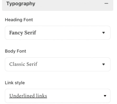
Fonts speak just as loudly as your words. They communicate tone, emotion, and readability so choose fonts that align with your message.
Heading Font:
You can select from several font options inside Substack. The heading font appears in your titles and section headers, so choose one that stands out while staying easy to read.
Body Font:
This is the main font for your newsletter posts. When you change it here, it automatically updates across your entire publication. Keep it simple, comfortable, and readable, especially for mobile users.
Link Style:
Decide how your links should appear — coloured or underlined. A consistent link style improves accessibility and makes it easier for readers to recognise clickable text.
Pro Tip: Use contrast between your headings, body, and links to create visual hierarchy. It helps readers flow through your content naturally.
🌱 Step 2: Design a Reader-Friendly Substack Homepage Layout
Next step is to start organising your homepage, inside the Homepage Layour you will be able to set up all of your articles, links and make stand out certain offer.
Header Layouts

The first thing you’ll want to do when building your Substack homepage is to choose your header style. This is the very first section your readers will see when they land on your publication, so selecting a style that reflects your tone and content is important.
Think of your header as your magazine cover, it sets the first impression.
For example, I chose the Magazine style because I wanted a more relaxed, visual look where multiple images could be displayed together.

This layout lets readers instantly see the mood of my publication. You can also pin an image within your header so readers know exactly where to start reading — it works beautifully as a visual anchor on your homepage.
Substack gives you six different header layout options to experiment with:
Feature: Highlights one main story or hero post — ideal for showcasing your most important article.
Newspaper: Great for writers who publish frequent updates or journalistic-style pieces.
Magazine: Offers a visual, balanced look that displays multiple images and posts at once.
Highlight: Perfect for creators who want to draw attention to one key story with supporting posts.
Media Feature: Works well if your publication includes video, podcasts, or other multimedia.
Podcast: Specifically designed for newsletters with an audio focus.
Spend a few minutes previewing each style to see what feels right for your publication.
Pinned Posts

To pin your best post: go to your post list → click the three dots → “Pin to homepage.”
This keeps your key story front and centre, its great for onboarding new readers.
Top Posts

Turn on “Top Posts” to automatically showcase your most-read articles. You can exclude specific posts from this section if needed. .
🌱 Step 3 : Advanced Settings
Once you’ve selected your header style, you can move into the Advanced Settings. This is where you can really start to experiment with the look and feel of your Substack homepage.
You can easily move content blocks around, test different arrangements, and preview how your layout appears to readers. Think of it as your creative playground — everything here can be edited, rearranged, and refined until it feels just right.Layout Options to Organise Your Content
You can add 4 different types of conntent blocks, those blcosk are ease to be added, just clck add a block and you will be able to see .

List Layout:

This layout displays your posts in a clean, tidy column. It’s perfect for essay-style newsletters or reflective writing where the focus is on the text.
You can also choose how many posts to show, anywhere from three to seven. The List Layout gives your Substack homepage a simple and elegant flow, making it easy for readers to scroll through your recent pieces.
You can even add side modules next to the list, such as:
Subscribe button to encourage sign-ups
Links section for external resources or your website
Recommendations to feature other Substack publications you enjoy
This format works beautifully if you want a more classic, editorial feel for your Substack website.
Grid Layout:

The Grid Layout shows your posts in blocks rather than a list. It’s ideal for visual publications or newsletters that cover multiple themes.
You can organise your posts by topic using tags, for example, “Marketing,” “Creativity,” or “Personal Growth.” This gives your Substack homepage a structured, magazine-like appearance, where readers can browse by category or theme.
Feature Section:

The Feature Section lets you spotlight specific content that you want readers to see first. For instance, I use this section to feature one of my blog posts that includes a free quiz, it guides new readers to interact with my content right away. You could feature a course, product, weekly reflection, or guide.
The key is to make this section stand out visually so readers instantly notice it. Use a strong header image or clear headline to draw attention.
Subscribe Section
This is the section where you can add a short, personal message to encourage readers to subscribe or become paid supporters. A clear and thoughtful call-to-action here can make a big difference, these few lines often double subscriber rates when written with intention and heart.
For Non-Subscribers:

This message appears when someone visits your Substack homepage but hasn’t subscribed yet. It’s your chance to welcome them and explain what your newsletter is about in one or two short sentences.
Example: “Subscribe to receive weekly reflections and creative lessons straight to your inbox..”For Subscribers:
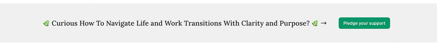
This message is shown to people who have already subscribed to your newsletter. You can use it to build deeper connection or gently encourage them to become paid supporters
Example: “Your support helps me write freely and keep this space ad-free.”


🌱 Step 4: Use Sidebars to Build Connection
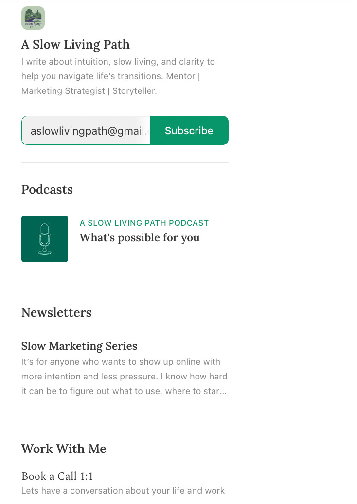
Sidebars are often overlooked, but they make your Substack website more like a full website.
You can add:
Contributors: Show who else writes with you , helps establish credibility.
Links: Create groups like “Work With Me” or “Resources.” Add links to your website, YouTube, or external guides.
Podcasts: Embed your episodes for easy access.
Recommendations: Feature other Substack publications you love — this builds community and cross-promotion.
For example, I added a “Work With Me” sidebar that links directly to my booking page.
Pro Tip: To add links to your sections, go to your Settings, click Website, then select Links. Here you can add all your important links and even group them into categories like Resources, Work With Me, or Tools I Love to keep your Substack homepage organised.
🌱 Step 5: Optimise Your Top Navigation
Your top navigation bar guides people through your Substack homepage. Add tabs like:
Start Here – introduce new readers.
About – share your story and mission.
Resources – link to helpful tools or products.
YouTube / Podcast – connect readers to your other channels.
This turns your Substack from “just a newsletter” into a fully-functioning Substack website that can host your whole creative brand.
🌱 Watch the Step-by-Step Tutorial
If you’re more of a visual learner, I’ve recorded a short video where I walk you through every step of setting up your Substack homepage, exactly as I explain in this post.
In the video, you’ll see how to:
Navigate the Substack website settings
Update your logo, colours, and typography
Rearrange your homepage layout using blocks
Add subscribe messages and sidebars
Preview your changes before publishing
It’s an easy, real-time walkthrough showing how I organised and designed my own Substack homepage from start to finish
🌿 Need Help Setting Up Your Substack Homepage?
If you’d like personalised help setting up or improving your Substack, I offer 1:1 Substack setup or audit sessions.
👉 Fill the Form for Substack Setup or Audit Session
Your turn
If you’re still reading, I’d love to know:
When you think about your Substack, what’s the bigger dream behind it — the kind of space or connection you hope to create?
Drop a comment. I read each one, and I reply with care.

It looks beautiful!
That was a lot of work explaining everything. Thank you. I’ll try to work some magic with mine.