
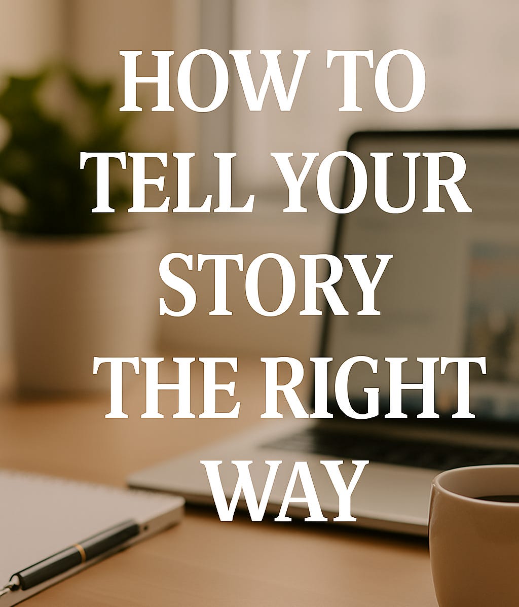
How to Use the New Substack Banner to Reflect Your Story (with 7 Creator Examples)
Are you looking to tell your story in one sentence? Your Substack profile banner might be the place to start.

When I woke up this morning, I didn’t plan to write this.
But a message from my mentor
, a few beautifully updated Substack profiles and a sense of curiosity hit me all at once.“Well done Substack for adding a cover image on top of our profiles! It looks a bit like LinkedIn… I adjusted my image to 3:1 in Canva. Nice way to announce my book launch.”
And just like that, I had the spark I needed.
So here we are.
In this post, I’ll share a little behind-the-scenes of how I created my Substack banner, plus a few lovely examples from other creators who’ve updated theirs too. It’s a small thing but sometimes a small change invites you to take up space in a new way.
Why This Small Design Change Matters
This isn’t about aesthetics.
It’s about expression.
For many of us, Substack isn’t just a place to post, it’s where we process transitions:
Change.
Career shifts.
Grief.
Faith.
The new banner is an invitation to visually reflect the very thing our words try to hold:
Who we are now.
What we care about.
And how we want others to feel when they land in our space.
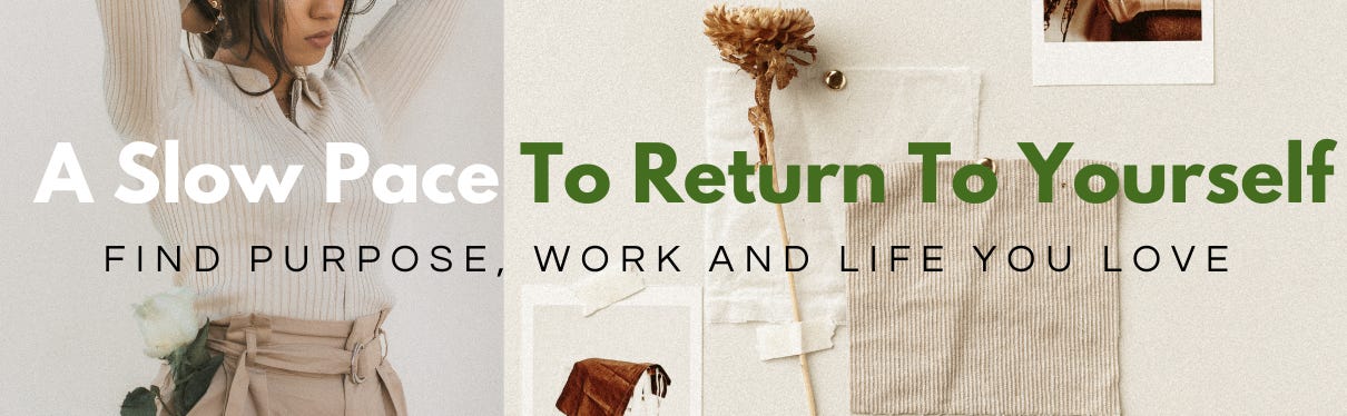
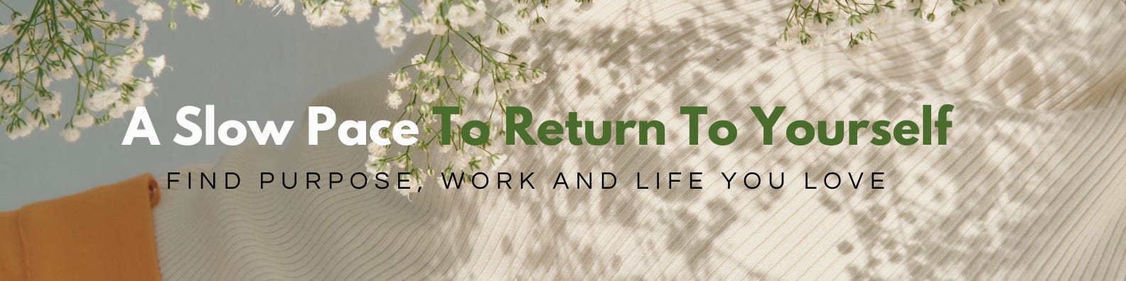
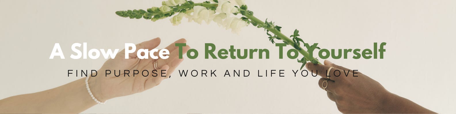
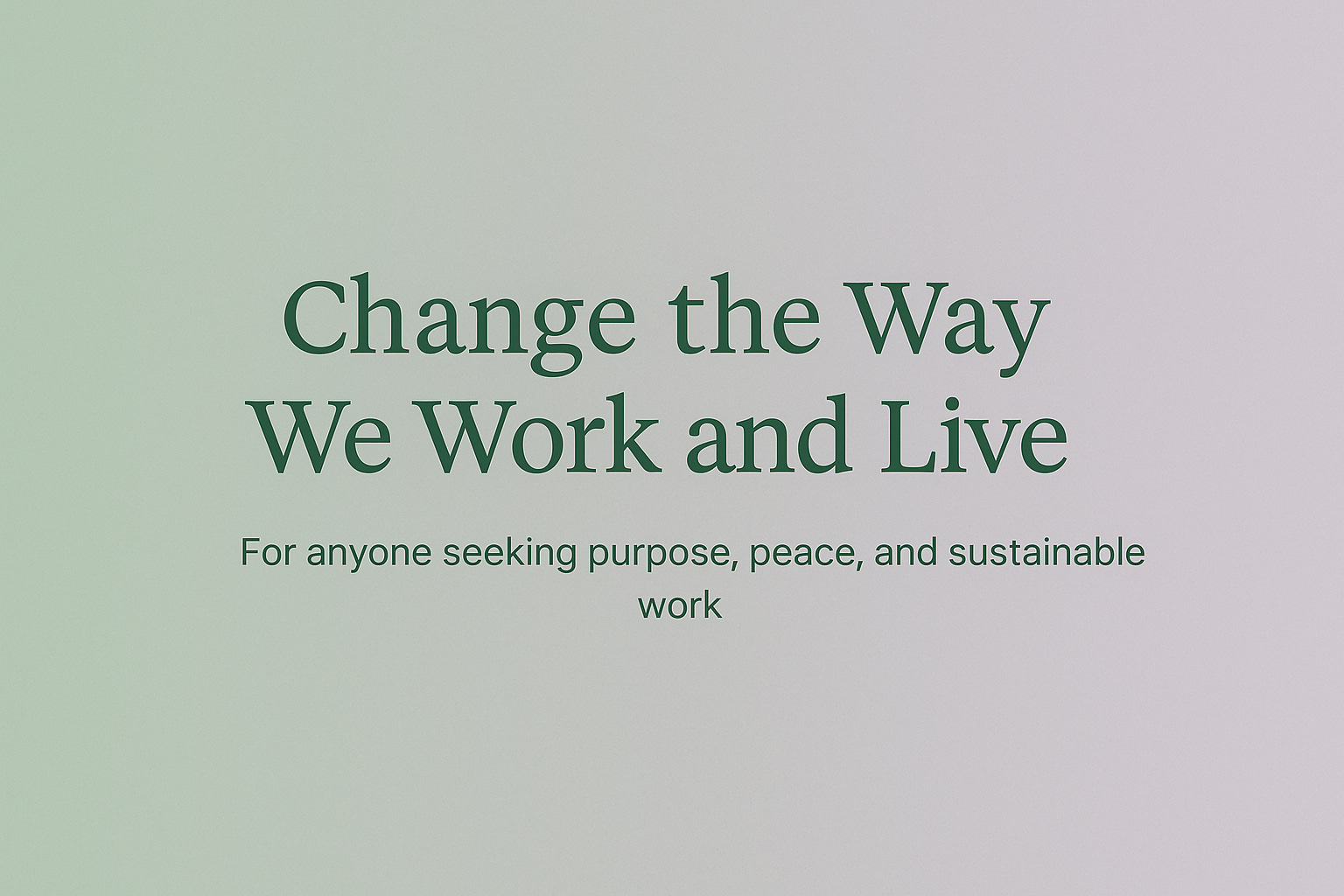
How I Thought About My Banner
I didn’t want something flashy. I didn’t want it to “sell.” I wanted it to feel like a pause.
I tried these phrases:
A slow pace to return to yourself
Find your purpose. Do meaningful work. Live a life you love.
Eventually, I created something that looked like my writing feels: soft serif font, sage green to lavender fade, open space on the right.
Because sometimes, the banner isn’t the story.
It’s the invitation to look closer.
The breath before the beginning.
Here are few I have experimented with …
How to Create a Substack Banner with Canva or ChatGPT
Here’s how you can make your own even if you’re not a designer.
Option 1: Use ChatGPT
At first, I asked ChatGPT to help me create a banner and honestly, it was a good starting point. It gave me something simple and clean, which was fine to test the layout. But after looking at it, I realised I wanted something that felt more me. So I moved over to Canva.
That said, if you’re short on time, using ChatGPT ) is still a great option. You can ask it to use your brand colours, suggest a headline, and even define the banner size and font style. It’s quick, and you’ll get something decent without overthinking it
Prompt example:
“Design a minimalist Substack banner (1200×400) with a sage green to lavender gradient. Add left-aligned serif font that says ‘A slow pace to return to yourself.’ Leave white space on the right for profile image. Style: reflective, soft, calm.”
Option 2: Use Canva
If you’d rather not start from scratch, good news: you don’t have to.
Here’s how to create your banner using Canva, step by step:
Open Canva
Click Create and Custom Size and enter 1200 × 400 pixels (that’s the recommended Substack banner size)
Choose a template — there are plenty to get you started. Just pick one that feels close to your tone
Swap the background if you’d like, and add your banner text (see below for inspiration from other Substack creators)
Keep your text left-aligned — your profile photo will appear on the right, so leave that space open
Export as PNG, then go to Substack → Settings → Profile → and upload your new banner
🎥 See a quick video I created to help create you Substack banner ( click below)
That’s it, you’re live with a banner that actually reflects what your space is all about.
How to Edit on Substack
Alright, now let’s look at how to update your banner on Substack.
Just head to your profile, click Settings, and scroll down until you see Banner Image.
Click Upload, choose your design (ideally 1200×400 pixels), and hit Save.
That’s it , your profile now has a visual tone that reflects your voice.
🎥 See a quick video I created to help ( click below)

How to Handle One Banner Across Multiple Newsletters
Some of you might have multiple publications on Substack, maybe one focused on business or strategy and another that’s more personal or even in a different language.
Since Substack only gives you one profile and one banner, it helps to choose a design and message that reflects your broader identity or values across both.
If the audiences are very different, you could keep the banner neutral and visually clean, or add a simple line that gestures to both themes like “writing on business + belonging”. If the split feels too wide, you might consider creating a second profile to give each one its own space and tone.
A Few Examples to Get You Inspired
Here’s how other creators are using the new Substack banner feature with intention, clarity, and personality.
– Using the banner as a launchpad
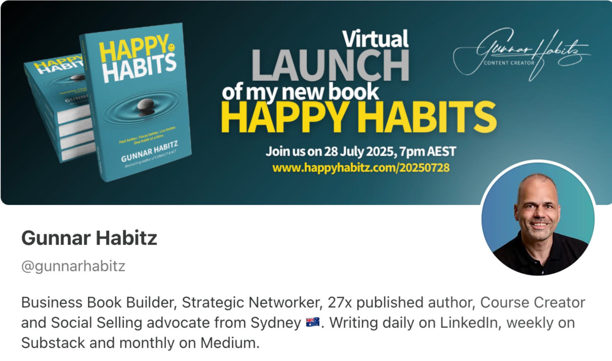
- Making a promise
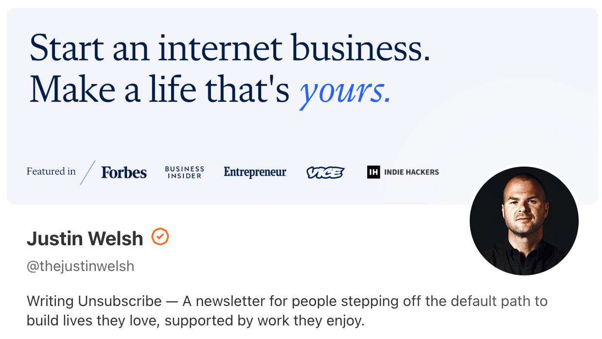
Justin’s banner doesn’t just look sharp, it makes a promise. He’s speaking to people who are tired of the 9-to-5 script and ready to build something they control, not just for income, but for freedom. The clean serif font, subtle colour shift, and trust-boosting logos (Forbes, Business Insider, etc.) all add to that credibility
– Showing the value upfront
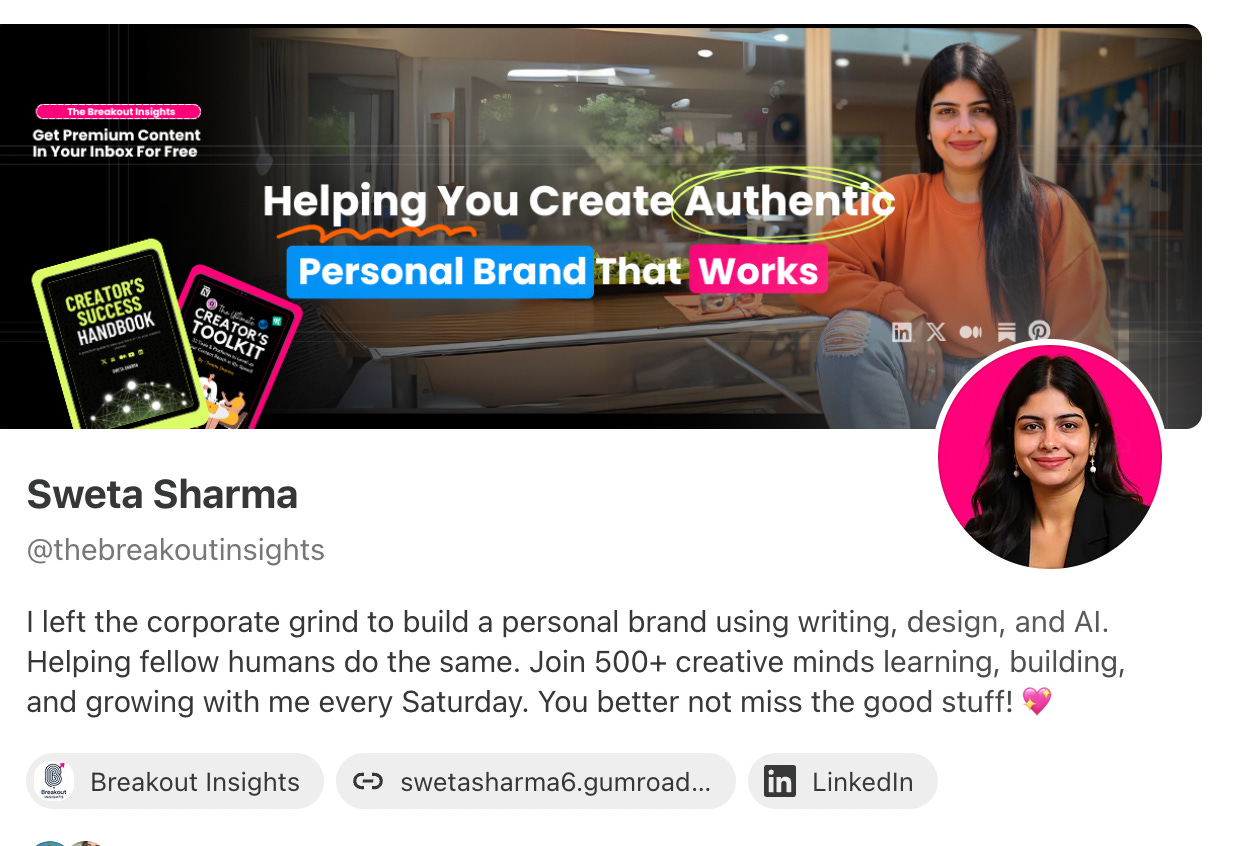
Sweta’s banner is doing a lot in a small space but it works. She tells you clearly what she does (“Helping you build an authentic personal brand that works”) and backs it up with visuals of her own guides and content. She even includes a note about free content in your inbox, which plants the seed for trust. It’s clean, confident, and direct. If your work blends personal storytelling with content or coaching, this is a great format to learn from.
– Making her whole brand feel like a vibe
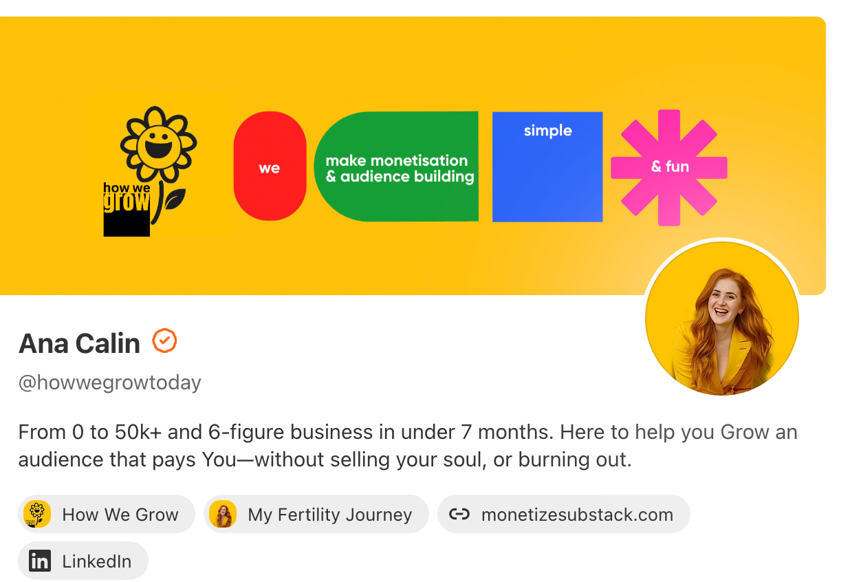
Ana’s banner hits you with colour, clarity, and fun — in that exact order. The message is simple: “We make monetisation and audience building simple & fun.” The bright visuals match her tone and her energy, and everything feels intentional. What I love most? You know what she’s about in one sentence. It proves that if your message is sharp, you don’t need to overcomplicate it.
– Minimal but emotionally honest
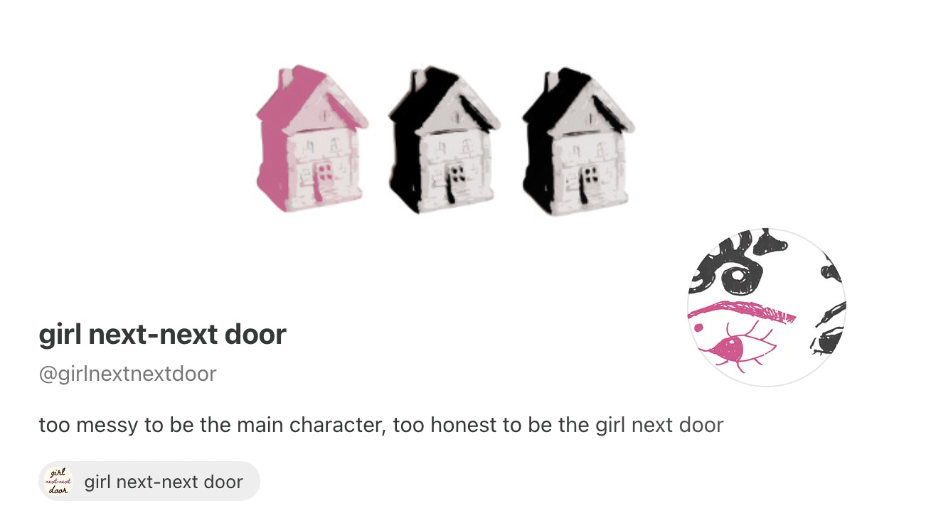
This one’s subtle and I love it for that. The banner doesn’t over-design or over-promise. It just feels real and like home. If your voice is raw, reflective, or a little chaotic (in the best way), this approach says: “Come as you are.”
– Full-on world-building
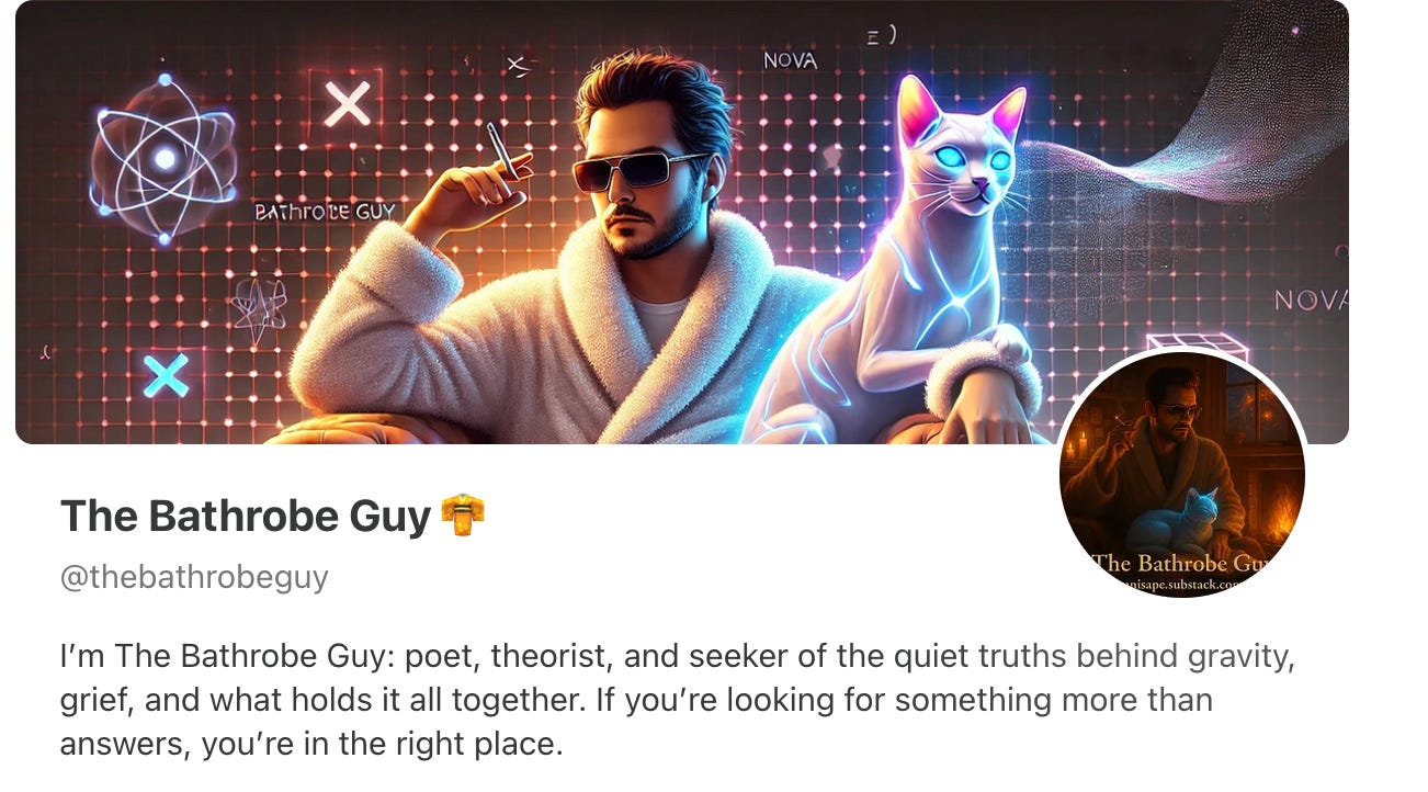
Okay , this one’s different. The Bathrobe Guy isn’t trying to sell anything. He’s building an atmosphere. With his robe, his glowing cat, and a grid of quantum symbols, you instantly feel like you’ve entered his universe. His profile backs it up: grief, gravity, and everything that holds us together. It works because it doesn’t explain, it invites.
Each of these banners tells a story, not just about what the writer does, but who they are. Whether bold, minimal, playful, or poetic, they all make it easier for the reader to feel what they’re stepping into.
And maybe that’s the real point of a banner.
It’s not just branding. It’s a doorway.

Final Thoughts: It’s Not Just a Banner
If you're in a season of slowing down, of coming home to yourself again after years of proving, pushing, surviving, this new Substack banner is more than a design feature.
It’s a chance to say, without words:
“Here’s where I write from now. Here’s what I believe matters.”
And sometimes, that’s all someone needs to read.
This post is the first in a new slow marketing series I’ll be sharing.
It’s for anyone who wants to show up online with more intention and less pressure. I know how hard it can be to figure out what to use, where to start, or how not to get overwhelmed. So I’ve decided to walk through some of these changes, slowly, simply, and supportively.
Just helpful content to help you navigate the tech and share your work with ease.
Have you seen a Substack banner that really stood out to you? What made it memorable?
Feel free to share your banner in the comments or reply with a link to your profile. Always curious what others are creating.
Thank you so much! It’s so nice to see what other creators are making. Love how everyone brings their own vibe to it.
Thanks for the feature:) Appreciate it.
I'm really liking this new addition.
Let's see what Substack brings next👀.