
How to build a branded newsletter on Substack
5 elements to include in your Substack newsletter that makes all the difference

Most Substack newsletters read like one endless post.
That’s exactly how I started too. Open a blank page, write what mattered to me, hit publish, and... done. No branding, no colors, no clear next steps. Just a wall of text, hard to read in one sitting, no images, no subscribe buttons, no sense of who I was or how to connect. I thought, “It’s just a newsletter. People are here to read.”
I see creators doing the same today. Even folks who’ve been on the platform for years say design doesn’t matter.
But then I started imagining my ideal reader, the one drinking their morning coffee, waiting to hear from me, opening their inbox with anticipation. My newsletter didn’t just need to deliver something valuable. It needed to feel like a moment they looked forward to — warm, intentional, familiar. Like slipping into their favorite sweater, not just reading words on a screen.

Your newsletter is about your message but it can also be an experience.
Shape how it looks and flows, and readers won’t just think, “Good piece,” and vanish. They’ll feel like they’ve stepped into your space and want to come back.
That’s where brand lives. It’s the feeling they carry after closing the tab, built through small, intentional choices in every issue.
The shift? From “I hope someone finds this” to “I’m designing how it feels to meet my work.”
The stakes are real: skip the experience, stay forgettable in a crowded inbox. Nail it, and your words become the newsletter people recognise, return to, and recommend.
Here are 5 simple things to add to every issue to build that brand.
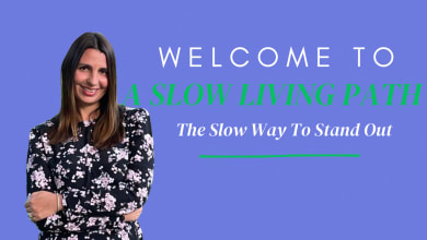
1. The Header Image: Your Visual First Impression

Every newsletter I design begins with a strong header image.
This is your visual welcome, the thing a reader sees before a single sentence lands. Sometimes it’s a banner with your newsletter name and a subtle tagline. Sometimes it’s a clean block of your brand colour with simple, confident typography. What it looks like matters less than what it communicates. The key is alignment: the header image should feel like the writing that follows it.
But here’s what most people don’t realise. That header image doesn’t just live inside your newsletter. It shows up on your Substack homepage, in preview cards when someone shares your post, in the feed when a reader is browsing. It becomes the face of your whole publication — not just one issue, but all of them. Go and look at your Substack homepage right now and notice what someone sees before they read a word. That’s your header doing its job, or not.

When I work with clients on building their newsletter brand, the header is almost always the turning point. The moment a clear, considered visual identity appears, everything shifts. It stops looking like a personal blog and starts looking like something intentional — something worth subscribing to.
That first impression is what readers carry into everything that follows.
2. Visual Breaks: Quotes, Branded Elements and Images

As the newsletter unfolds, quotes, branded elements, and images begin to guide the reading experience.
Quotes
Quotes are one of the easiest ways to turn your message into a visual moment. You lift a single line from your own writing and give it its own space, so it emphasises the core idea and naturally slows the reader down. A simple quote image at the top of your newsletter can set the tone for the whole issue and because it’s shareable on its own, it also gives other people something clear and beautiful to pass on.
Branded elements
From there, small branded elements carry the content forward. I use simple devices — a coloured block with a short phrase, a recurring icon, or a styled subheading — to break longer sections into something more breathable. Designed within my brand palette, these elements reinforce identity while creating emphasis, and over time they build the kind of subconscious recognition that makes your newsletter feel familiar, even in a crowded inbox.
Images
Then there are the images that hold everything together visually: photos, illustrations, or graphics that echo your tone and colour scheme. None of it is complicated, but when your visuals, palette, and typography are working in harmony, the whole piece feels like it’s been thought through. That feeling — that someone cared about how this reads and looks — is your brand.
3. Thoughtful Placement of Subscribe and Upgrade Buttons

When I first started on Substack, someone left a comment on one of my newsletters: “How do I subscribe?”
I’d missed adding an obvious button. That was my wake-up call. If someone wants to stay and has to hunt for how, I’ve already made their experience harder than it needs to be.
Now I design the subscribe and upgrade flow into every issue.
A simple subscribe prompt goes near the beginning for new readers who’ve just landed on a single post and don’t know me yet. Then I add two gentle upgrade prompts — one in the middle, one at the end — for people who already know they want more.
On the page, it might look like a lot. In practice, it’s an act of care. You’re not pushing; you’re removing friction. The next step is right there when they’re most likely to think, “Yes, I want to keep going with this.
4. A clear “How to work with me“

This is the section most people scroll past — and the one that quietly holds your biggest opportunity.
If your newsletter connects to a business, a practice, or services you offer, this is where you make the path forward clear. In one short paragraph, answer three simple questions: what you do, who it’s for, and how to start.
“[Right now, I work with solo founders on personal branding and newsletter strategy. If you’d like help turning your voice into something people recognise and remember, here’s where to begin.]”
It doesn’t need to sound clever or salesy. It just needs to be clear so the people already thinking, “I wish I could work with them,” know exactly what to do next.
The ones who need you can’t find you if you don’t tell them you’re here.
5. A Human Closing

I’ve read so many wonderful newsletters where I finish the last line, close the tab, and still have no idea who wrote it.
No face. No context. Just words floating in space.
End every issue with a brief, repeatable closing that puts a person behind the publication.
A small photo and a few lines: who you are, what this newsletter’s about, why you write it. Most readers don’t find your first post — they land in the middle of your story with zero context. This section catches them up in 30 seconds.
“Here’s who’s speaking to you. Here’s why I’m here. Here’s what you can expect if you stay.”
This is where content becomes a relationship. People subscribe to people, not publication.
The Branding Principle
See your newsletter as your house and yourself as the creative director.
You wouldn’t leave that house empty or blank. You’d want to design it, fill it with touches that make it feel like home.
Do the same with your Substack. Every header, visual break, and invitation is your chance to shape something unmistakably yours.
I’ve written about what it actually looks like to rebuild a business on Substack — the decisions, the doubts, and why I chose this platform over everything else.
And if you’ve ever wondered whether your gut instinct belongs in your brand, this one on intuition and personal branding might be the most useful thing I’ve written.

This newsletter will always have a free layer. But if my work has been meaningful to you and you’re in a position to support it, upgrading to a paid subscription makes a real difference. Paid members help keep this space sustainable and focused on depth over speed.
🌿 Are you dreaming for this..

If reading this feels a bit overwhelming, that’s exactly why I created the Substack Clarity & Conversion Audit. I’ll walk through your newsletter step by step showing you how to shape your Substack into something that genuinely supports your creative business.


Great post! I love using quotes and little brand elements intentionally, definitely feels like elevating and caring for your words a little more - giving them their own time and space to shine. Still playing around with my own pacing within a post, but fun to explore!
I love how you described adding subscribe buttons as a kind way to "remove resistance" for your reader, great advice!